January 10, 2008 at 10:05:21 AM CET
|
(Graphics) by jussuf
|
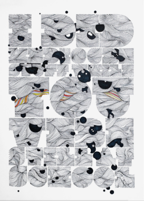
The site www.poskot.net is a nice mirror for some influences that are definitely worth to be mentioned.

As we can tell form the header the Ukraine is part of the Web 2.0 world, and shaded logos and the famous black gloss plate are inevitable parts of this phase.
Concerning the graphic artworks featured here the basic influences are minimal styles, Helvetica, the sixties, the seventies with their magic ornaments and some "John Maeda styles" www.maedastudio.com .
What's Russian here?
First you will notice that the words, though written in the Latin alphabet are not part of any official language. This stuff is called "translit", the way to write Russian without using Cyrillic letters. To make this special cultural code more secret, it is furthermore a special slang called "mat" (/from the Russian word for mother). It's a language that is famous for the extreme amount of curse words included. (mainly explicit sexual topics)
The next nice feature are trademarks from the Soviet past which are recycled in contemporary subjects, like a "fake Louis Vuitton bag" carrying the symbols of the famous Russian "33 cows" milk brand and the Poskot logo instead of the LV initials.

The general conclusion can very well reflect what is currently happening in Russian culture. It's a trend back to any positive values from the past, from the "good old times" before the iron curtain came down and western capitalism rolled over the country, blasting away anything that was considered to be "old fashioned" or associated with communism. Now old brands reappear on the market and "made in Russia" starts to stand for quality and positive traditions. The artworks on the featured site might look like a caricature of pop-art, but in my opinion they are a beautiful illustration of this cultural turn. Post-Soviet Countries are finding their own style, on one hand based on their own history, on the other hand on extremes like the culture shock the West had brought in the early 90ies.
jmw2008
January 4, 2007 at 6:50:48 PM CET
|
(Graphics) by booney
|
sind n bisschen mürbe in der Birne... meine Fresse. anbei mein emailtechnischer Schlagabtausch mit denen. Der zeigt beste Performance auf höchstem Niveau was Kundenfreundlichkeit angeht.
Es ist sehr bedauerlich, wenn Sie mit unserem Produkt und der
ausfuehrlichen Antwort nicht zufrieden sind. War sicherlich nicht beabsichtigt, denn wir haben uns wie man nachvollziehen kann sehr viel Muehe gegeben, hohe Qualitaet und Quantitaet zu einem sehr geringem Preis auf den Markt zu bringen.
Wahrscheinlich ist aber einfach das einstige "Letraset-Rubbel-Bogen-Setzprinzip" nicht bekannt, sonst wuerden Sie das Konzept der NBW55RLS Rubbel-Schrift verstehen und damit etwas anfangen koennen.
Uebrigens: Hier kann man einen guten Ueberblick zu wesentlich
geringerwertigem VektorEPS-Material dafuer jedoch hoeheren Preisen (ohne Druckwerk) erhalten:
www.youworkforthem.com
Alles Gute und viel Erfolg im Neuen Jahr.
Lieben Gruss/Kind regards
Typen@NeubauLaden.com
Am 04.01.2007 um 11:54 schrieb benjamin nadjib:
Der vorgefertigte Text der Antwort zeigt, daß wohl schon einige
ähnliche Emails bei Ihnen eingetroffen sind. Ein schaler Nachgeschmack
bleibt.
Gruss
B. Nadjib
----- original Nachricht --------
Betreff: Re: Neubauwelt
Gesendet: Do, 04. Jan 2007
Von: Typen@neubauladen.com
Danke fuer den Kauf von Neubau Welt.
NBW ist eine umfangreiche Enzyklopedie von insgesamt 1247
Vektorillustrationen.
Die zusätzlichen Schriften (NBWBlatt, NBWUrban, NBW55RLS) runden das
Konzept des Buches ("digitales Letraset") ab.
Das Schriftexperiment NBW55RLS:
Mit dieser Schrift ist alles in Ordnung, sie ist nicht kaputt und soll
genauso aussehen wie sie dargestellt ist, handelt es sich doch um die
Letraset Version von der NB55R (mit der das Buch gestaltet wurde). Als
Analogie zu den Letraset-Rubbelboegen (1960-1984), existieren all jene
Buchstaben ("NBWELT55RLS") von der NBW55RLS, die fuer das Insert in
NBW
(Seite 288) verwendet/weggerubbelt wurden, nur mehr als
Grundlinienmarkierung. Das ist das besondere Merkmal dieser
Schriftversion.
Die NBW55RLS besteht aus 256 Zeichen, 11 davon besitzen die
Letrasettypische Grundlinienmarkierung, 245 Einzelzeichen. Es wird
empfohlen alternative Tastenkombinationen zu verwenden um alle Zeichen
der Schrift (inkl. der vermeintlich fehlenden) darzustellen.
Wie im Buch auf Seite 288 im Fusszeilenhinweis angegeben (vgl. NOTE),
gibt es jedoch auch eine regulaere Version, die NB55RLS, im
NeubauLaden.com zu kaufen.
Diese und diverse andere Neubau Schriften, Produktdetails und
Preisinfos gibt es hier:
www.neubauladen.com
Wir hoffen diese Information hilft.
Am 04.01.2007 um 11:21 schrieb benjamin nadjib:
Guten Tag!
Ich habe mir das Buch "Neubauwelt" gekauft. Unter anderem auch wegen
der auf dem Cover versprochenen 3 Typefaces. Diese versprochenen
Schriftarten liegen jedoch lediglich in "beschnittener" Fassung bei.
Dazu fand sich
Ich möchte Sie daher bitten, mir die Schriftarten vollständig
zukommen
zu lassen.
Mit freundlichem Gruß
Benjamin Nadjib
--
digitalsalat - benjamin nadjib
www.digitalsalat.com
benjamin@digitalsalat.com
--- original Nachricht Ende ----
January 2, 2007 at 9:52:14 AM CET
|
(Graphics) by splammo
|
Schöne Illustrationen und Umgang mit Typo.
www.non-format.com
April 26, 2006 at 10:27:43 PM CEST
|
(Graphics) by aemkei
|
Reach out and help a little, flatfaced character to make it into the real world!
By sponsoring your own, personal orphan, your donation will be invested directly and entirely into one character's upbringing. Not only will the world be a better place, you will never feel alone again.
... www.pictoorphanage.com
February 16, 2006 at 9:38:03 PM CET
|
(Graphics) by mikk
|
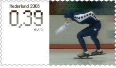
Dutch agency Solar Initiative from Amsterdam designed two full motion stamps for the dutch postal service. They used lenticular technology to realize the animation of the ice skaters.
Watch this short video.
|
Online for 8823 days
Active across Europe:
Hamburg,
Weimar, Berlin, Dresden, Moscow
Youre not logged in ... Login
Sebastiano Comix Damerisano rettet die Musikbranche gleich doppelt:
Comixxx erfindet ein neues Vertriebsmodell für Langspielplatten. Ein wirklich genialer Schachzug des umtriebigen Berliners mit Plauener Wurzeln: Platte im Bundle mit Pizza, für Kenner kurz und schlicht "P'n'P". Die Mechanik verblüfft: ein Anruf bei der lokalen Pizzeria reicht, einfach Lieblingspizza bestellen, z.B. Nr ...
by sol @ 12/13/14, 7:50 AM
=(>.<)=
by aemkei @ 12/11/14, 5:14 PM
Great one via the stellar Boing Boing.
Mizubitchy- Quality Kitten Pix since 2003.
by sol @ 12/11/14, 5:09 PM
FIXED!
by sol @ 12/4/14, 3:41 PM
Ich finde keinen Knopf die Notifications abzustellen! Hilfe!
by Malfatti @ 12/4/14, 12:53 PM
Moinsen Junkens,
wie schaumer aus? Heute habe ich mal die Bildschirmlupe eingeschaltet und ich muss sagen, so gehts ganz gut. Auch voll schön mal wieder HTML Tags zu benutzen und in so ein kleines, schrubbliges HMTL Formular zu schreiben. Irgendwie süß.
Aber: es geht heute um was ganz anderes. In eigener Sache. ...
by sol @ 12/4/14, 12:50 PM
Ja wie krass, oder?? THE SHOW MUST GO ON. TILDE CLUB.
by sol @ 12/4/14, 12:41 PM
OMG! Ich hab grad von hinten angefangen zu lesen. So viel cooler Stuff aus der Zukunft!
by aemkei @ 12/4/14, 11:48 AM
Du hast jetzt Rechte!
by sol @ 12/4/14, 11:32 AM
You got it, Holmes!
by sol @ 12/3/14, 9:40 PM
|
